Thursday, March 31, 2016

April Your Passion Your Art Kit (Flying Unicorn)


http://www.flyingunicornstore.com

Flying Unicorn has heard your requests and granted your wish!

The Flying Unicorn monthly, Your Passion Your Art kit is now bigger than ever - overflowing with all the goodies you desire with all our previous kits rolled into one GRAND collection...
ONE month, ONE kit.

The Flying Unicorn now includes papers, an "Off the Page" project, a mixed media collection, and all the coordinated embellishments in one kit, and at one crazy magical price of $59.99.


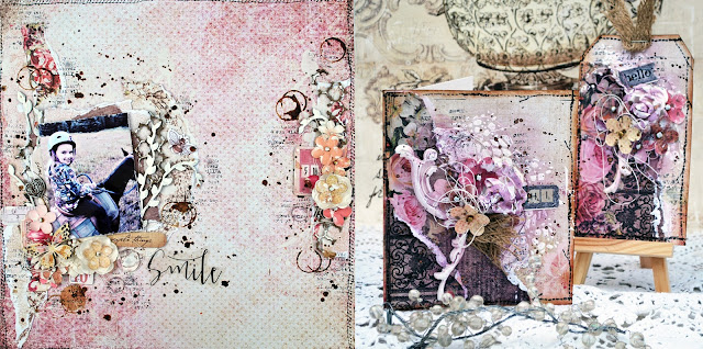
Here are some close-ups of your next kit!


Play along with our Inspiration Board. Post your work to our Facebook Page and be featured!

Here's what the Creative Team designed


The Flying Unicorn Creative Team will be dazzling you during the month with step-by-step tutorials on the "Today" Blog pages, videos, weekly USTREAM shows and helpful crafty tips.
You'll see some amazing projects from these educators this month:


Are you visiting the Tallahassee area soon?
Stop in and say hello!
Plan a day trip! Crops -Classes-Fun
926 North Monroe St
Tallahassee, Florida
Tel: 850.270.6366 Toll Free 800.231.7119


Sunday, March 27, 2016

My Friend, My Partner (Flying Unicorn guest designing at CSI)

Bonjour,

Ce mois-ci, Flying Unicorn est équipe invitée par CSI. J'ai choisi de résoudre le case file 195. Voici ma page.

Hi,

This month, Flying Unicorn is guest designing over at CSI. I chose to solve the case file 195. Here is my layout.


Voici le dossier.
Here is the file.


J'ai choisi les rayures, les fleurs (oui oui!) et les taches d'encre. J'ai aussi choisi, comme inspiration, le mot amitié (friendship).

I chose stripes, flowers (can you believe it?) and ink splats. As for inspiration, I chose the word friendship.


Saturday, March 26, 2016

Happy (Blue Fern Studios)

Bonjour,

Voici ma troisième création pour Blue Fern Studios ce mois-ci.

Hi, 

Here is my third layout for Blue Fern Studios this month. 

Happy


Ma page utilise le très beau papier West Plaza de la collection Courtship Lane. J'ai choisi mes couleurs en observant le motif imprimé sur l'arrière-plan du papier.

My last layout uses the beautiful West Plaza paper. I chose the colors of my layout based on the damask pattern of the paper.


J'ai utilisé les étampes de l'ensemble Garden Frolic pour ajouter de la texture à mon fond. 

I used the Garden Frolic stamp set to stamp randomly on my background.


Pour encadrer mon image, j'ai utilisé les deux pièces de l'ensemble Celebration Hearts que j'ai embossées avec la poudre à embosser Imagine Ink Snow. J'ai construit mes agencements de fleurs autour de ces deux pièces. 

To frame my picture, I used the Celebration Hearts, which I embossed with Imagine Ink Snow embossing powder. I built my flower clusters around them.


Mon titre provient du The Optimist Word Set. Je l'ai embossé avec de la poudre à embosser Imagine Ink Lilac et je l'ai collé par-dessus mes embellissements. 

My title piece, from The Optimist Word Set, was embossed with Imagine Ink Lilac embossing powder and glued over my embellishments.

Bonne journée.
Have a nice day.

Friday, March 25, 2016

Perfect (Blue Fern Studios)

Bonjour,

Voici ma deuxième création pour Blue Fern Studios.

Hi, 

Here is my second layout for Blue Fern Studios.

Perfect


Cette page est plutôt colorée. J'ai choisi le papier Parkway de la collection Courtship Lane pour mon fond. J'ai été inspirée par la plume qu'on retrouve sur la bordure gauche pour choisir les couleurs. 

My layout is very colourful. I chose the Parkway paper from the Courtship Lane collection as my background. I was inspired by the colors of the feather on the left of the page. 


Mon sketch est basé principalement sur les deux pièces de chipboard de l'ensemble Whimzy Flourishes. Je les ai embossés avec la poudre à embosser Imagine Ink Garnet. 

My composition on mainly based on the Whimzy Flourishes that frame my picture. I embossed them with Imagine Ink Garnet embossing powder. 


J'ai construit mes agencements de fleurs autour des deux Flourishes. J'ai aussi détouré quelques fleurs qui proviennent de certaines cartes du papier Calling Cards de la collection Courtship Lane. On les voit à travers mes fleurs: ça ajoute de la dimension. On peut aussi voir qu'ici et là, j'ai utilisé les estampes Forever pour ajouter un peu de texture à mon fond. 

I created my flowers clusters around the two flourishes. I also fussy cut some flower from the Calling Cards paper to put in my clusters, to give dimension. You can see, in a few places, that I used the Forever stamp set to add a bit of texture to my background. 


Mon titre, qui provient de l'ensemble Perfect, Adorable, Special, est embossé avec de la poire à embosser Imagine Ink Iris. 

My title, part of the Perfect, Adorable, Special set, is embossed with Imagine Ink Iris embossing powder.

Merci du passage.
Thanks for stopping by.

Thursday, March 24, 2016

Love (Blue Fern Studios)

Bonjour,

Je vous partage aujourd'hui ma première création pour Blue Fern Studios ce mois-ci. 

Hi,

I'm sharing my first creation for Blue Fern Studios this month. 

Love


Pour cette création, j'ai utilisé deux papiers de fond: Town Gossip et Concert Hall, tous deux de la collection Courtship Lane. J'ai altéré mon fond avec du modeling paste et un masque. Par la suite, j'ai ajouté de la couleur avec mes aquarelles de Shimmerz. J'ai aussi utilisé une carte du paper Calling Cards dans mon agencement de papiers.

For this layout, I used two paper as my background: Town Gossip and Concert Hall, both from the Courtship Lane collection. I altered them with modeling paste and a stencil, and I added color with my Shimmerz watercolor. I also used a card from the Calling Cards paper in my paper cluster.


Ma pièce centrale est le Bordeaux Layered frame. Il vient en deux morceaux. Celui du dessous, je l'ai apprêté avec du gesso blanc et j'ai ensuite vaporisé des encres roses pour agencer la couleur avec celle du papier. Pour la partie travaillée du dessus, je me suis contentée de la laisser peinte avec du gesso blanc. J'aimais le contraste.

My main chipboard piece is the Bordeaux Layered frame which come in two parts. The bottom one, I painted with white gesso and sprayed mists over it, to match the color in the background paper. For the swirly top part, I covered it with white gesso. I chose to leave it white because I thought it was contrasting over the pink chipboard.


Alors que je fouillais dans ma boîte de plus petits chipboards, je suis tombée sur une petite pièce d'un morceau qui vient du Leafy Page Accents et que j'avais coupée. Je l'ai peinte en blanc aussi et je l'ai placée juste sous mon cadre, pour emplir l'espace vide qu'il y avait entre mon cadre et ma photo. Je ne jette jamais les petits morceaux comme ceux-là, ils peuvent toujours servir.

While I was looking in my box of smaller chipboards, I found a little piece (you can see it in the picture above, just below my frame) that came from a flourish from the Leafy Page Accents. I painted it with white gesso also, to match the frame. I thought it filled the gap between my flower and my frame perfectly. I never throw away even the tiniest pieces: you never know when they can come handy.


Mon titre, un morceau de l'ensemble appelé Adore, Love, Cherish, a aussi été peint avec du gesso blanc. 

My title piece, from the Adore, Love, Cherish set is also painted plain white.

Bonne journée
Have a nice day.


Friday, March 18, 2016

Beauty (Shimmerz)

Bonjour,

Je vous présente aujourd'hui une création faite pour Shimmerz Paints. Quand j'ai reçu ma commande de Shimmerz Paints, j'ai tout de suite eu envie d'utiliser le Vibez Rolling in the Hay. J'ai donc concocté la page suivante.

Hi,

I'm sharing today a layout made for Shimmerz Paints. When I received my most recent order, I wanted to use the Rolling in the Hay Vibez right away. I came up with this layout.


J'ai utilisé trois couleurs pour faire mon fond: Spritz Tuscan Sun, Vibez Rolling in the Hay et Coloringz Don't Be Suede pour ajouter un peu de contraste. J'ai appliqué les couleurs en faisant des gouttes avec mon pinceau, une à la fois, en m'assurant de sécher entre chaque couleur.

I used three colors to make my background: Tuscan Sun Spritz, Rolling in the Hay Vibez and Don't Be Suede Coloringz to add a bit of contrast. I applied the colors with my paint brush to make ink spatters, one by one, making sure to heat dry between each color.


J'ai aussi appliqué du modeling paste avec deux masques, pour ajouter de la texture.

I also applied modeling paste through two stencils, to add texture.


Ma photo ne rend pas justice à la brillance qu'on voit sur la page. Rolling in the Hay est vraiment iridescent!

My photo doesn't show all the shimmer effect of the Vibez. Rolling in the Hay is very shimmering! It's stunning.